Icon Editor
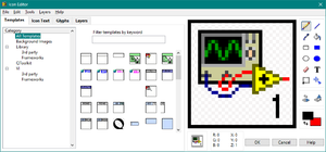
The Icon Editor dialog box is a built-in tool in the LabVIEW IDE to help create custom icons for VIs. The VI Icon is an important documentation tool because it controls the appearance of the VI as a SubVI on the Block Diagram. In LabVIEW 2009 the Icon Editor was completely redone. This page is for the Icon Editor for LabVIEW 2009 and later. For the Icon Editor before LabVIEW 2009 see the page Icon Editor (LabVIEW 8.6 and Earlier).
Accessing the Icon Editor
To access the Icon Editor do one of the following: From the Block Diagram, Front Panel, or Control Editor windows:
- Double-click on the Icon
- Right-click on the Icon and select, Edit Icon...
- Select File»VI Properties or File»Control Properties to display the VI Properties dialog box or Control Properties dialog box, respectively. Then select General from the Category pull-down menu and click the Edit Icon button.
- Right-click a project library, statechart, class, or XControl item in the Project Explorer window and select Properties from the shortcut menu to display the corresponding Properties dialog box. Then click the Edit button on the General Settings page.
Parts of the Icon Editor
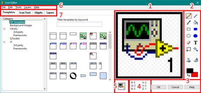
|
Layers
VI or Library icons are saved with information in Layers. The use of layers allows the modification of overlapping parts of an icon separately.
User Layers
There can be multiple User Layers. A user layer is created when a layer is purposely created on the Layers page by clicking the Add Layer button or through the Layers»Create New Layer menu item, or anytime a glyph is drag-and-dropped into the Icon edit area. A layer is also created when editing if no user layer currently exists.
Special User Layers
A number of special user layers exist that are only differentiated from other user layers by the layer name. They are:
- NI_Library - This is the Library Banner that is added to a VI Icon. When a VI is moved between libraries or classes, the banner can be updated by the Edit»Import Icon from Owning Library menu item. Note: this layer name shouldn't be changed it you want it to be updatable through the menu item or when the library icon is changed.
- VI Icon - This is the default icon for the VI.
- Clipboard - This occurs when something is pasted into the icon.
Non User Layers
Templates and Icon Text are the only two Non User Layers and can only be updated through their respective pages in the Icon Editor or through the Icon API.
Layer Order
The Layer Order is as follows (top to bottom z-order):
- Icon Text Layer
- User Layers (as ordered in the Layer page or by the Icon API)
- Template Layer
Editing Tools
The editing tools are the set of buttons right of the Icon Edit Area. The tools consist of the following:
| Symbol | Tool Name | Actions | ||||
|---|---|---|---|---|---|---|
| Single Click | Double Click | Left-Click in Edit Area | Right-Click in Edit Area | |||
| Pencil Tool | Selects Tool | Nothing | Draws individual pixels with the Line Color (or if starting pixel is the Line Color toggles to using the Fill Color) | Draws individual pixels with the Fill Color (or if starting pixel is the Fill Color toggles to using the Line Color) | ||
| Line Tool | Selects Tool | Nothing | Draws line by with Line Color | Draws line by with Fill Color | ||
| Dropper Tool | Selects Tool | Nothing | Selects the color clicked on as the Line Color | Selects the color clicked on as the Fill Color | ||
| Fill Tool | Selects Tool | Nothing | Fills all connected pixels of the Line Color | Fills all connected pixels of the Fill Color | ||
| Rectangle Tool | Selects Tool | Adds a one-pixel border to the entire icon in the Line Color | Draws a rectangle with the Line Color | Draws a rectangle with the Fill Color | ||
| Filled Rectangle Tool | Selects Tool | Adds a one-pixel border to the entire icon in the Line Color and fills the icon in the Fill Color | Draws a rectangle with the Line Color as the border filled in with the Fill Color | Draws a rectangle with the Fill Color as the border filled in with the Line Color | ||
| Ellipse Tool | Selects Tool | Nothing | Draws an ellipse with the Line Color | Draws an ellipse with the Fill Color | ||
| Filled Ellipse Tool | Selects Tool | Nothing | Draws an ellipse with the Line Color as the border filled in with the Fill Color | Draws an ellipse with the Fill Color as the border filled in with the Line Color | ||
| Eraser Tool | Selects Tool | Nothing | Draws individual pixels as transparent | |||
| Text Tool | Selects Tool | Display the Text Tool page of the Icon Editor Properties dialog box. Use this page to specify the font, alignment, and font size of the text you enter with the Text tool. | Either click places the starting position of the text. While text is active, you can move the text by pressing the arrow keys. Note: This text is not the same as the Text layer. | |||
| Select Tool | Selects Tool | Select the entire icon | Draws selection rectangle. Note: You can cut, copy, or move pixels only from user layers which don't include the Template or Text layers. | |||
| Move Tool | Selects Tool | Nothing | Moves all pixels in the user layer you select. Use the Select tool to move pixels from multiple user layers at once. | |||
| Horizontal Flip Tool | Horizontally flips the selected user layer. Note: You also can press the <F> key to flip a user layer you select. | Nothing | ||||
| Clockwise Flip Tool | Rotates the selected user layer in a clockwise direction. If you do not select a layer, this tool rotates all user layers. Note: You also can press the <R> key to rotate a user layer you select. | Nothing | ||||
| Color Selection Tools | Line Color Selector | Pops-up color selector for selecting Line Color | Nothing | |||
| Fill Color Selector | Pops-up color selector for selecting Fill Color | |||||
| Swap Color Arrows | Swaps the Line Color and Fill Color | |||||
'
Editor Pages
Templates Page
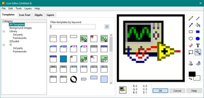
The Templates page allows for the selection of common templates such as a blank VI with a banner or just a banner. It also shows previously used and save templates. The Templates page also facilitates finding a template by Category or by keyword search. The keyword search is by the filenames of the template. The categories are the subfolder groupings in the Icon Templates folder.
Templates are saved on disk at:
with LabVIEW Data existing in the Documents folder on Windows OS.
Icon Text Page
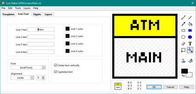
The Icon Text page allows for up to four lines of text and text color and provides controls for Font, Alignment, Size, Center text vertically, and Capitalize text. The Icon Text will try to position the lines so they are all within the border of the Icon. A good size and font choice for text icons are 9-point Small Fonts in all caps and Center text vertically and Capitalize text both TRUE. With this size of font, each line can only be six (6) to seven (7) characters long. A plain icon with border can fit four lines of text this way. In an icon banner, try to only use one line but two can fit. For an Icon with a Library banner, the text will stay under the banner if the icon also has a border. In this pattern, three lines of text can fit.
| Good Icon | ||||||||
| Bad Icon | ||||||||
Glyphs Page
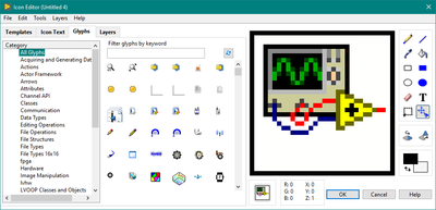
Glyphs are small graphical components to an icon. They are used to convey the function of the VI where text wouldn't fit or if trying to make the VI usable for international use across languages. Glyphs are selected and dragged from the Glyphs page into the icon edit area. When dropped a new user layer is created with the layer name being the glyph name. New glyphs can be created and saved, see the section Save As Glyph. The Glyphs page also facilitates find a glyph by Category or by keyword search. The keyword search is by the filenames of the glyphs.
Layers Page
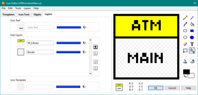
The Layers page of the Icon Editor allows configuration of the name, opacity, visibility, and order of the User Layers and the opacity and visibility of the Non-User Layers. It also allows selecting, adding, deleting, and re-ordering of the User Layers. The Layers Page is not shown by default, to make it visible select Layers»Show Layers Page in the Icon Editor' menu. After doing so, it will remain visible by default until turning it off through the same menu item.
Menu Items
File

| Menu Item | Keyboard Shortcut | Action |
|---|---|---|
| Save As...»Template | Saves the current icon design to the Template directory. | |
| Save As...»Glyph | Saves the current icon design to the Glyph directory. | |
| Close | Ctrl+W | Closes the Icon Editon. |
Edit
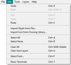
| Menu Item | Keyboard Shortcut | Action |
|---|---|---|
| Undo | Ctrl+Z | Undoes last action. |
| Redo | Ctrl+Shift+Z | Redoes last action. |
| Cut | Ctrl+X | Cuts the selection to the clipboard. |
| Copy | Ctrl+C | Copies the selection to the clipboard. |
| Paste | Ctrl+V | Pastes the selection from the clipboard. |
| Import Glyph from File | Pops-up File selector to import a PNG, BMP, JPG from file. | |
| Import Icon from Owning Library | Applies the Library banner to the icon. Item is greyed-out if the VI is not part of a library or class. | |
| Select All | Ctrl+A | Selects everything. |
| Select None | Ctrl+D | Deselects everything. |
| Clear All | Ctrl+Shift+Delete | Deletes everything. This includes removing the Template, deleting all Icon Text, and deleting all User Layers. |
| Clear User Layers | Ctrl+U | Deletes all User Layers. |
| Select Font... | Ctrl+F | Opens the Icon Editor Properties dialog to the Text Tool page. |
| Show Terminals | Ctrl+T | Toggles visibility of a overlay on the Icon Edit Area showing the current connector pane pattern. |
Tools

| Menu Item | Keyboard Shortcut | Action |
|---|---|---|
| Synchronize with ni.com Icon Library | Pops-up dialog to help download icon library from NI.com. This includes Templates and Glyphs. Note: This requires internet connection. | |
| List Glyphs and Icon Templates | Generates an HTML file with all Templates and Glyphs and opens the file in the default web browser. | |
| Icon Editor Properties | Ctrl+P | Opens the Icon Editor Properties dialog box. |
Layers
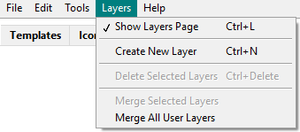
| Menu Item | Keyboard Shortcut | Action |
|---|---|---|
| Show Layers Page | Ctrl+L | Toggles visibility of the Layers page. |
| Create New Layer | Ctrl+N | Creates a new user layer. |
| Delete Selected Layers | Ctrl+Delete | Deletes the selected user layers on the Layers page. |
| Merge Selected Layers | Merges selected user layers on the Layers page into one user layer. | |
| Merge All User Layers | Merges all user layers into one user layer. |
Help

| Menu Item | Keyboard Shortcut | Action |
|---|---|---|
| Show Context Help | Ctrl+H | Toggles visibility of the Context Help window |
| Lock Context Help | Ctrl+Shift+L | Locks visibility of the Context Help window |
| LabVIEW Help... | Ctrl+? | Opens the LabVIEW Help. |
Icon Editor Properties
Templates Properties Page
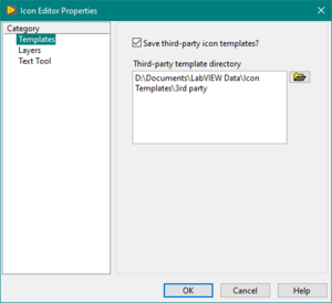
This page determines if and where third-party templates are saved. Third-party templates are template used by VI's whose template is not one of the standard ones.
Layers Properties Page
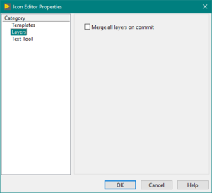
This page determines if all user layers are merged automatically when the Icon Editor is dismissed with the OK button.
Text Tool Properties Page
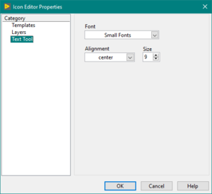
This page determines the font used by the Text Tool. This is not the font used by the Icon Text.
Best Practices
- Use glyphs instead of text for published APIs and libraries
- For text icons font 9-point Small Fonts in all caps and Center text vertically and Capitalize text both TRUE. With this size of font, each line can only be six (6) to seven (7) characters long.
Tips and Tricks
- Double-click the Text tool to quickly access the Text Tool Settings in the Icon Editor Properties dialog.
- Double-click the Select tool to select all layers of an icon (this is a fast way to delete the default icon).
- Double-click the Rectangle tool to draw a rectangle of the size of the icon.
- Double-click the Filled Rectangle tool to draw a filled rectangle of the size of the icon.
- Press Ctrl to temporarily switch to the Dropper tool for the front color.
- Press Ctrl+Shift to temporarily switch to the Dropper tool for the back color.
- Use the arrow keys to move layers pixel-by-pixel.
- Leave empty space around an icon to draw a smaller icon.
- Drag an image over a VI icon on the front panel or block diagram to use the image as icon.
- Copy the icon of an existing VI or function from the block diagram into the Icon Editor with Ctrl+C and Ctrl+V.
- Use the Select tool to select a target area before pasting data from the clipboard to automatically fit the content inside the selected area (will size to fit).
History
| Version | Change(s) |
|---|---|

|
In LabVIEW 2012 the Icon API is released as Object-Oriented Classes. It allows for scripting Icons with access to Text, Glyph, and user layers. |

|
In LabVIEW 2010 the Import Glyph from File and Import Icon from Owning Library was added to the Edit menu. |

|
In LabVIEW 2009 the Icon Editor was completely redone to allow different layers in an Icon with tabs for Templates, Icon Text, and Glyphs. See the page Icon Editor (LabVIEW 8.6 and Earlier) for the editor for LabVIEW 8.6 and earlier. |
See also
External links
- Enhanced Icon Editor - NI Community Page
