Control editor: Difference between revisions
m →See also: Add pointers to the control template |
m →Purpose of the control editor: Fix superfluous "[[" |
||
| (15 intermediate revisions by 2 users not shown) | |||
| Line 1: | Line 1: | ||
''Note'': This article uses the term "control" and "indicator" interchangeably. | |||
The | The '''Control editor''' provides the ability to create and modify [[Control|controls]], [[Type Definition|type definitions]] and [[Strict Type Definition|strict type definitions]]. It works like a [[Front Panel|front panel]] but it can only contain a single control and doesn't have a [[Block Diagram|block diagram]]. | ||
'' | == Ways to open the control editor == | ||
The control editor can be opened in multiple ways: | |||
* By opening an existing [[Control|control]] or [[Control Template|control template]] file. | |||
* From the [[Getting Started Window]] via the ''File'' menu option ''New...'', by selecting ''Other Files >> Custom Control''. | |||
* From the right-click menu of a control via ''Advanced >> Customize...''. | |||
* From the [[Front Panel]] of a [[VI]] via the ''Edit'' menu option ''Customize Control...''. | |||
== Purpose of the control editor == | |||
[[File:Control Editor - Examples of Visual Control Customizations.jpg|thumb|Examples of visual control customization on a front panel using a Push Button]] | |||
The visual appearance of controls (their ''shape'', ''coloring'', ''visibility of elements'', ''font'' and ''state'') can be changed directly on the front panel of a VI. It is, however, not possible to change the [[Control Parts|fundamental parts]] (''icons'', ''images'', ''relative positions'', ...). This can only be done in the control editor. | |||
Also, the control editor allows to store controls on disk for later re-use and to specify the type of control which changes how new instances of the control are related to each other: | |||
* [[Control|control]] (no relation) | |||
* [[Type Definition|type definition]] (share logical configuration) | |||
* [[Strict Type Definition|strict type definition]] (share logical configuration and visual appearance) | |||
<br clear=all> | |||
== Invalid Control button == | |||
[[File:Control Editor - Invalid Control.jpg|thumb|Invalid Control error in the control editor window (because it contains two controls)]] | |||
The '''Invalid Control''' button appears at the menu bar when the editor contains invalid elements, for example when the editor contains more than one control. This button opens the [[Error list]] dialog with further error details. | |||
<br clear=all> | |||
== Modes == | |||
The control editor has two modes: '''Edit Mode''', which works like a regular front panel, and '''Customize Mode''', which detaches individual parts of the control (''icon'', ''frame'', ''label'', ...). There are multiple ways to switch between modes if the control is valid: | |||
* By clicking the ''Change to Customize Mode'' and ''Change to Edit Mode'' button, respectively. | |||
* Using the ''Operate'' menu option ''Change to Customize Mode'' and ''Change to Edit Mode'', respectively. | |||
* Using the ''Window'' menu option ''Show Parts Window'' (forces the editor into customize mode, even if the control is invalid). | |||
* With the key-combination ''Ctrl+M'' to toggle between modes. | |||
== | === Edit Mode === | ||
In '''Edit Mode''' controls can be customized the same way as on a front panel. There are, however, a few additional functionalities that are unique to the control editor: | |||
{{ambox | |||
|text=What are these "other" options that the edit mode makes available? | |||
* Import pictures for the current control state (via right-click menu) | |||
* Specify the type of control (control/type def./strict type def.) | |||
* ...? | |||
}} | |||
=== Customize Mode === | |||
[[File:Control Editor - Individual Parts of a Control.jpg|thumb|Individual parts of a control (Push Button)]] | |||
[[File:Control Editor - Individual Parts of a Control 2.jpg|thumb|Individual parts of a control (Push Button) spread apart in the control editor]] | |||
In '''Customize Mode''' individual [[Control Parts|parts of the control]] are disconnected and can be changed and relocated. Depending on the type (''button'', ''graph'', ''list'', ...) and style (''Classic'', ''Modern'', ''System'', ''Silver'', ''NXG'') of control, the number and type of parts can vary. It is therefore important to begin with the right control to get the desired flexibility. For example, the mouse hover effect is only available for controls of type ''System'', ''Silver'' and ''NXG''. | |||
== | ''Important note'': It is '''not''' possible to add or remove parts from a control. This is a limitation of LabVIEW that was fixed in NXG<sup>[''citation needed'']</sup>. | ||
Each part is surrounded by a white rectangle. Because [[Control Parts|parts]] are often placed on top of each other to achieve the desired visual effect, the '''Control Parts''' window allows to scroll and select specific parts. The selected part can then be changed via right-click menu options. | |||
When switching back to '''Edit Mode''', all parts keep their current (relative) position, size and visual appearance. | |||
<br clear=all> | |||
==== Control Parts window ==== | |||
[[File:Control Parts Window.jpg|thumb|This is the Control Parts window]] | |||
The '''Control Parts''' window appears when selecting ''Show Parts Window'' from the ''Window'' menu. It contains a picture ring with the [[Control Parts|individual parts]] of the current control and input boxes to change the position and dimension of the currently selected part. | |||
<br clear=all> | |||
== | ==== Right click menu options ==== | ||
{| class="wikitable" | |||
! Option | |||
! Description | |||
|- | |||
| <code>Copy to Clipboard</code> | |||
| Copies the value (text or picture) of the part to clipboard. | |||
|- | |||
| <code>Import Picture from Clipboard</code> | |||
| This option is only available if the clipboard contains a picture. Adds the picture as background image for text items or substitutes the current picture for picture items. The item size will fit the size of the picture. | |||
|- | |||
| <code>Import from Clipboard at Same Size</code> | |||
| This is the same as ''Import Picture from Clipboard'', but the picture is scaled to fit the size of the item. | |||
|- | |||
| <code>Import from File...</code> | |||
| Opens the file browser to select a picture file. Adds the picture as background image for text items or substitutes the current picture for picture items. The item size will fit the size of the picture. | |||
|- | |||
| <code>Import from File at Same Size...</code> | |||
| This is the same as ''Import from File...'', but the picture is scaled to fit the size of the item. | |||
|- | |||
| <code>Revert</code> | |||
| Reverts the item to its last saved state. | |||
|- | |||
| <code>Original Size</code> | |||
| Restores the last saved size of the item. | |||
|} | |||
Depending on the type of part, additional menu options are available: | |||
'''Picture Item''' | |||
{| class="wikitable" | |||
! Option | |||
! Description | |||
|- | |||
| <code>Picture Item</code> | |||
| Opens a list of picture items. Selecting an picture from the list will change the value of the item to the selected value. | |||
|- | |||
| <code>Independent Sizes</code> | |||
| When enabled, the size of all picture items are independent. This option is disabled by default. | |||
|} | |||
'''Label''' | |||
{| class="wikitable" | |||
! Option | |||
! Description | |||
|- | |||
| <code>Size To Text</code> | |||
| When enabled, the size of the item automatically adjusts to the size of the contained text. | |||
|- | |||
| <code>Vertical Arrangement</code> | |||
| Changes the text direction (None, Stacked, Clockwise, Counterclockwise). The default setting is "None". | |||
|- | |||
| <code>Lock Label</code> | |||
| Locks the label in place, so that the entire control moves with the label. This option is disabled by default. | |||
|} | |||
'''Text Item''' | |||
{| class="wikitable" | |||
! Option | |||
! Description | |||
|- | |||
| <code>Text Item</code> | |||
| Opens a preview of text items. | |||
|} | |||
=== | ==== Import Picture to Clipboard... ==== | ||
Opens a file dialog to select a picture that is imported to clipboard. | |||
== See also == | == See also == | ||
| Line 66: | Line 160: | ||
* [https://www.ieee.li/pdf/viewgraphs/creating_quality_uis_with_labview.pdf Creating Quality UIs with LabVIEW] | * [https://www.ieee.li/pdf/viewgraphs/creating_quality_uis_with_labview.pdf Creating Quality UIs with LabVIEW] | ||
* [https://forums.ni.com/t5/UI-Interest-Group/ct-p/7019 LabVIEW Forum: UI Interest Group] | * [https://forums.ni.com/t5/UI-Interest-Group/ct-p/7019 LabVIEW Forum: UI Interest Group] | ||
* [https://knowledge.ni.com/KnowledgeArticleDetails?id=kA00Z0000019NmtSAE National Instruments Knowledge Base: Creating a Boolean Button with Custom Appearance] | |||
* [https://knowledge.ni.com/KnowledgeArticleDetails?id=kA00Z0000019KxFSAU National Instruments Knowledge Base: Customize LabVIEW Boolean Controls with Bitmap Images or GIFs] | |||
* [https://forums.ni.com/t5/LabVIEW/Custom-Button-Nugget/td-p/1564566 LabVIEW Forum: Custom Button Nugget] | |||
== References == | == References == | ||
<references /> | <references /> | ||
[[Category:User | [[Category:User interface]] | ||
Latest revision as of 20:57, 30 May 2020
Note: This article uses the term "control" and "indicator" interchangeably.
The Control editor provides the ability to create and modify controls, type definitions and strict type definitions. It works like a front panel but it can only contain a single control and doesn't have a block diagram.
Ways to open the control editor
The control editor can be opened in multiple ways:
- By opening an existing control or control template file.
- From the Getting Started Window via the File menu option New..., by selecting Other Files >> Custom Control.
- From the right-click menu of a control via Advanced >> Customize....
- From the Front Panel of a VI via the Edit menu option Customize Control....
Purpose of the control editor
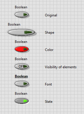
The visual appearance of controls (their shape, coloring, visibility of elements, font and state) can be changed directly on the front panel of a VI. It is, however, not possible to change the fundamental parts (icons, images, relative positions, ...). This can only be done in the control editor.
Also, the control editor allows to store controls on disk for later re-use and to specify the type of control which changes how new instances of the control are related to each other:
- control (no relation)
- type definition (share logical configuration)
- strict type definition (share logical configuration and visual appearance)
Invalid Control button
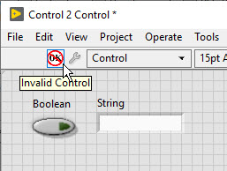
The Invalid Control button appears at the menu bar when the editor contains invalid elements, for example when the editor contains more than one control. This button opens the Error list dialog with further error details.
Modes
The control editor has two modes: Edit Mode, which works like a regular front panel, and Customize Mode, which detaches individual parts of the control (icon, frame, label, ...). There are multiple ways to switch between modes if the control is valid:
- By clicking the Change to Customize Mode and Change to Edit Mode button, respectively.
- Using the Operate menu option Change to Customize Mode and Change to Edit Mode, respectively.
- Using the Window menu option Show Parts Window (forces the editor into customize mode, even if the control is invalid).
- With the key-combination Ctrl+M to toggle between modes.
Edit Mode
In Edit Mode controls can be customized the same way as on a front panel. There are, however, a few additional functionalities that are unique to the control editor:
Customize Mode

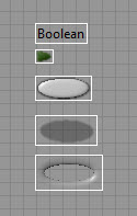
In Customize Mode individual parts of the control are disconnected and can be changed and relocated. Depending on the type (button, graph, list, ...) and style (Classic, Modern, System, Silver, NXG) of control, the number and type of parts can vary. It is therefore important to begin with the right control to get the desired flexibility. For example, the mouse hover effect is only available for controls of type System, Silver and NXG.
Important note: It is not possible to add or remove parts from a control. This is a limitation of LabVIEW that was fixed in NXG[citation needed].
Each part is surrounded by a white rectangle. Because parts are often placed on top of each other to achieve the desired visual effect, the Control Parts window allows to scroll and select specific parts. The selected part can then be changed via right-click menu options.
When switching back to Edit Mode, all parts keep their current (relative) position, size and visual appearance.
Control Parts window
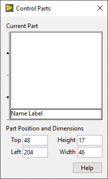
The Control Parts window appears when selecting Show Parts Window from the Window menu. It contains a picture ring with the individual parts of the current control and input boxes to change the position and dimension of the currently selected part.
| Option | Description |
|---|---|
Copy to Clipboard
|
Copies the value (text or picture) of the part to clipboard. |
Import Picture from Clipboard
|
This option is only available if the clipboard contains a picture. Adds the picture as background image for text items or substitutes the current picture for picture items. The item size will fit the size of the picture. |
Import from Clipboard at Same Size
|
This is the same as Import Picture from Clipboard, but the picture is scaled to fit the size of the item. |
Import from File...
|
Opens the file browser to select a picture file. Adds the picture as background image for text items or substitutes the current picture for picture items. The item size will fit the size of the picture. |
Import from File at Same Size...
|
This is the same as Import from File..., but the picture is scaled to fit the size of the item. |
Revert
|
Reverts the item to its last saved state. |
Original Size
|
Restores the last saved size of the item. |
Depending on the type of part, additional menu options are available:
Picture Item
| Option | Description |
|---|---|
Picture Item
|
Opens a list of picture items. Selecting an picture from the list will change the value of the item to the selected value. |
Independent Sizes
|
When enabled, the size of all picture items are independent. This option is disabled by default. |
Label
| Option | Description |
|---|---|
Size To Text
|
When enabled, the size of the item automatically adjusts to the size of the contained text. |
Vertical Arrangement
|
Changes the text direction (None, Stacked, Clockwise, Counterclockwise). The default setting is "None". |
Lock Label
|
Locks the label in place, so that the entire control moves with the label. This option is disabled by default. |
Text Item
| Option | Description |
|---|---|
Text Item
|
Opens a preview of text items. |
Import Picture to Clipboard...
Opens a file dialog to select a picture that is imported to clipboard.
See also
- Control
- Type Definition
- Strict Type Definition
- Control Template
- CTL File Extension
- CTT File Extension
External links
- LabVIEW 2018 Help: Creating Custom Controls, Indicators, and Type Definitions
- LabVIEW 2018 Help: Creating Custom Controls and Indicators Using the New Dialog Box
- LabVIEW 2018 Help: Creating Custom Controls and Indicators from the Front Panel
- National Instruments Knowledge Base: Creating Custom Control or Indicator in LabVIEW
- LabVIEW Forum: "Create a custom control (combination of controls)"
- DMC: Basic LabVIEW UI Control Customization
- Creating Quality UIs with LabVIEW
- LabVIEW Forum: UI Interest Group
- National Instruments Knowledge Base: Creating a Boolean Button with Custom Appearance
- National Instruments Knowledge Base: Customize LabVIEW Boolean Controls with Bitmap Images or GIFs
- LabVIEW Forum: Custom Button Nugget
