Tab control
| |
This article is a stub. You can help LabVIEW Wiki by expanding it. Please improve this article if you can. |
| |
This article or section needs to be wikified to meet LabVIEW Wiki's quality standards. Please help improve this article with relevant internal links. |
Styles
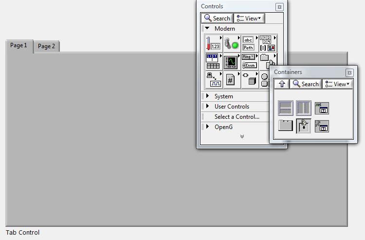
1- LabVIEW-style Tab Control. In the modern palette, select subpalette "Containers" and insert Tab Control.
Although it doesn't seem as professional-looking as the system-stye tab control, it's color can be modified. The system's tab control cannot.

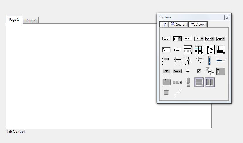
2- System-Style Tab Control. In the system palette, select the Tab Control.

Elements of Tab Control
When building a user interface, it is common to hide the tab control label. Use a significant naming convention for your tab(s) in order not to get mixed up in your block diagram, especially if you have many tab controls.
There are three states for tabs. Tabs can be enabled (i.e. user selectable), disabled (looks the same has enabled state, but not selectable), or disabled and grayed. This last state is a useful feature for password-protected configuration tabs. The state can be programmatically controlled (see properties below).
In addition to page enabling, it is possible to hide a tab altogether using the page visibility properties. An example of how you can use this feature would be if you have a generic UI but you want to keep some features out-of-reach of operators and show the features for maintenance or machine administrator.
The page label display is hidden by default. To show it, it is required to right-click on the tabs and select >>Visible Items/Page Labels Display. The tabs are shown by default. It is possible to hide them (to control tabbing programmatically) >>Visible Items/Tabs.
Properties
There are many properties to a Tab Control. The most important ones are shown below.
Show/hide the tabs (page selector).


