Boolean controls: Difference between revisions
mNo edit summary |
Add sections for Boolean text and Mechanical action |
||
| Line 1: | Line 1: | ||
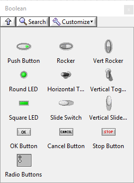
[[File:BooleanPaletteFP.png|thumb|Boolean controls (modern style)]] | [[File:BooleanPaletteFP.png|thumb|Boolean controls (modern style)]] | ||
Boolean controls and indicators are available on the Boolean controls palette. | Boolean controls and indicators are available on the Boolean controls palette. The number of available controls varies depending on the selected style. | ||
All controls and indicators on this palette, except [[Radio buttons|Radio Buttons]], return or display Boolean values. | |||
<br clear=all> | |||
== Boolean text == | |||
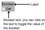
All Boolean controls can display a [[Boolean text]] to describe the current state (i.e. ON/OFF): | |||
[[File:BooleanText.png]] | |||
It is a set of up to four strings that can represent the state of the Boolean control. If the Boolean text is visible it also toggles the value of the control. | |||
The Boolean text can be set manually, or via the string[] property. | |||
If you provide one (1) string you set a generic value, with two (2), yet set the ''False'' and ''True'' values. | |||
If you provide three (4) values you set a ''False'', ''True'', ''False to True'' and ''True to False'' values. | |||
== Mechanical action == | |||
Boolean controls have mechanical actions, which control how activation with the mouse affects the value of the control. A mechanical action allows the control to mimic certain physical actuators (e.g. a light switch or an emergency stop button). | |||
[[File:MechanicalActions.png|frameless|border|Mechanical actions]] | |||
The six types of mechanical actions are: | |||
{| class="wikitable" | |||
! Behavior | |||
! Mechanical action | |||
! Description | |||
|- | |||
! rowspan="3" | Switch | |||
| [[File:SwitchWhenPressed.png|frameless|border|none|Switch when pressed]] when pressed | |||
| The value of the control change each time it is clicked. This is similar to a light switch. | |||
|- | |||
| [[File:SwitchWhenReleased.png|frameless|border|none|Switch when released]] when released | |||
| The value of the control only changes once the mouse button is released within the boundary of the control. | |||
|- | |||
| [[File:SwitchUntilReleased.png|frameless|border|none|Switch until released]] until released | |||
| The value of the control changes only so long as the mouse button is held down. When the mouse button is released, the control returns to its default value. | |||
|- | |||
! rowspan="3" | Latch | |||
| [[File:LatchWhenPressed.png|frameless|border|none|Latch when pressed]] when pressed | |||
| The value of the control is updated when the mouse button is depressed. Once the VI reads the value of the control, it returns to its default value. | |||
|- | |||
| [[File:LatchWhenReleased.png|frameless|border|none|Latch when released]] when released | |||
| The value of the control is updated when the mouse button is released within the boundary of the control. Once the VI reads the value of the control, it returns to its default value. | |||
|- | |||
| [[File:LatchUntilReleased.png|frameless|border|none|Latch until released]] until released | |||
| The value of the control is updated while the mouse button is held down, or until the VI reads the value, whichever comes first. | |||
|} | |||
The latch behavior can not be used if the control has a local variable on the block diagram. | |||
== See also == | == See also == | ||
Revision as of 18:30, 19 July 2019

Boolean controls and indicators are available on the Boolean controls palette. The number of available controls varies depending on the selected style. All controls and indicators on this palette, except Radio Buttons, return or display Boolean values.
Boolean text
All Boolean controls can display a Boolean text to describe the current state (i.e. ON/OFF):
It is a set of up to four strings that can represent the state of the Boolean control. If the Boolean text is visible it also toggles the value of the control.
The Boolean text can be set manually, or via the string[] property. If you provide one (1) string you set a generic value, with two (2), yet set the False and True values. If you provide three (4) values you set a False, True, False to True and True to False values.
Mechanical action
Boolean controls have mechanical actions, which control how activation with the mouse affects the value of the control. A mechanical action allows the control to mimic certain physical actuators (e.g. a light switch or an emergency stop button).
The six types of mechanical actions are:
The latch behavior can not be used if the control has a local variable on the block diagram.


